

Assignment:
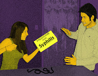
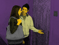
For this weeks assignment it was now time to add color to our comics. It was time to make our comics “pop.” We discussed making things “pop” in the previous couple of classes and it was time to test them out on our comics. With making it pop we had to choose our two colors do this and we choose purple and yellow.
Craft:
This was a more remember the steps work then a difficult step. To make this work we changed the background to a normal layer, added a blank colored layer, and then added a new layer for each thing we colored. This is nice because say we wanted to change our colors all we would have to do is use the paint bucket on each layer on the colors we painted.
Composition:
I talked about making it pop in the assignment part and that’s basically what we did to arrange our elements. With choosing the colors we had to make one color the blank background, which was the purple. After that we had to use a yellow color because they are opposites on the color wheel so the yellow “pops” on a purple surface. In our pictures we decided to focus on the important things in the picture and color them yellow.
Concept:
With the comic we tried to tell a story. With the color we are adding an element to it, which makes it easier to read. With adding the color the less important information sort of fades to the background and we can pop the important stuff. Then with our story we added that suspense up until last class with having the last scene secret. Everyone thought it was a good story until they saw what our package was.


Craft (how it was made)
ReplyDeleteThis was a group project between James and Zach and they had to create a comic. The both of them had to come together adn brainstorm and have several rough drafts of this comic.They had to take pictures of places and people. They used photoshop and comic life to accomplish this project. They had to photoshop people in different places.
Composition (how it was arranged)
They started with a great title page that captures peoples attention. They had two great color purple and yellow. The colors helped to give importance to certainthings in the image. I think they had great organization. The comic was easy to read and had great dialogue.
Concept (what it is about)
The comic is about a couple who are in a relation ship. The boy is waiting for the girl, then he has a surprise for her. The surpise is not all that great since it's syphilis. The comic is easy to understand.
Craft:
ReplyDeleteThis project was actually a partner project. It was created by both James and Zach. The assignment was to creat a comic. The only limitations that were given was a person traveling and a person waiting. Also, one of the two had to have a package for the other person. They first took pictures and then transformed them in photo shop. They had to use filters and different colors to make the pictures look more comic like. They also used other photo shop techniques to get a point across in the pictures. After they were done, they then tranfered the pictures to comic life to put it into a comic format.
Composition:
They started with the title and then when through each picture telling a different part of the story. The yellow color was used to make images stand out from the purple. The comic went in order in a clear and understandable way. The images really gave off what was going on in the story, and how each image was laid out showed the important information.
Concept:
The concept of the story was about a boy and girl who meet. They develop a relationship and end up having sex. They talk on the phone. When the girl returns she has a surprise for the boy which is a STD. The story gives a funny twist to the guidelines of the assignment.
Craft: They put layers for the diferrent colors that they put in the pictures to make it pop. This project was made in Photoshop and Comiclife. First, they edited all of the pictures in Photoshop and then transferred all the pictures to Comiclife to create the comic format.
ReplyDeleteComposiition: They chose the contrasting colors yellow and purple to make the images pop. They chose the brighter color which is yellow for the important details in the pictures.
Concept: To make the comic more easier to read they had to make the images "pop" using the contrasting colors. They had a twist at the end of the story that is quite funny and entertaining.
Craft: I came across The unwanted package comic first on this blog. I like that it used a mix of photographs and comic attributes to make the comic.
ReplyDeleteComposition: I like the two color choices it used and the expressions of the characters in the photos. They are very animated and perfect for a comic.
Concept: I love the package for the comic strip. I wouldn't have been so bold in picking that package but it was funny.